|
In addition to designing the feature and flag of each issue, I more broadly drive the creative direction of The Harbinger. I'm constantly brainstorming with section editors on how they may make their pages more intriguing and impactful. Each issue, section editors and I thoroughly plan extensive design ideas for their in-depth pieces.
|
Redesigning The Harbinger
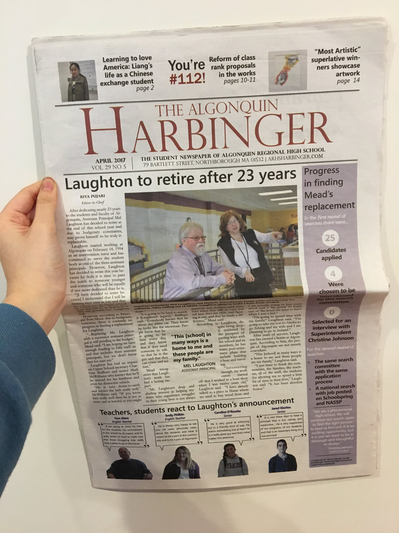
The Harbinger before redesign
|
For years, The Harbinger has been using a traditional broadsheet format, with traditional headers, fonts and other elements. This year, I took on the project of aligning our design with more contemporary styles to create more visually-rich pages. Inspired by the newsmagazine style of numerous other student publications, I redesigned our front page, added spot colors to a select page on each section and incorporated a new header featuring page numbers and sections to echo the new look. I also created a distinct color theme for each issue that would appear on full-color pages and also be carried over to spot color pages, contributing to the branding of The Harbinger. Because this change drastically shifted our styles and habits, I then worked extensively with each section to make sure cohesive design is being implemented throughout the newspaper for consistency. As we make the stylistic switch from a traditional newspaper to a modern newsmagazine, we're constantly discovering and updating new styles and elements, such as vertical bars, sidebars, drop caps and headline formats; to create consistency for future issues, I'm currently working on an updated stylebook to document style elements that work and our general aesthetic as a publication.
|
Front Page
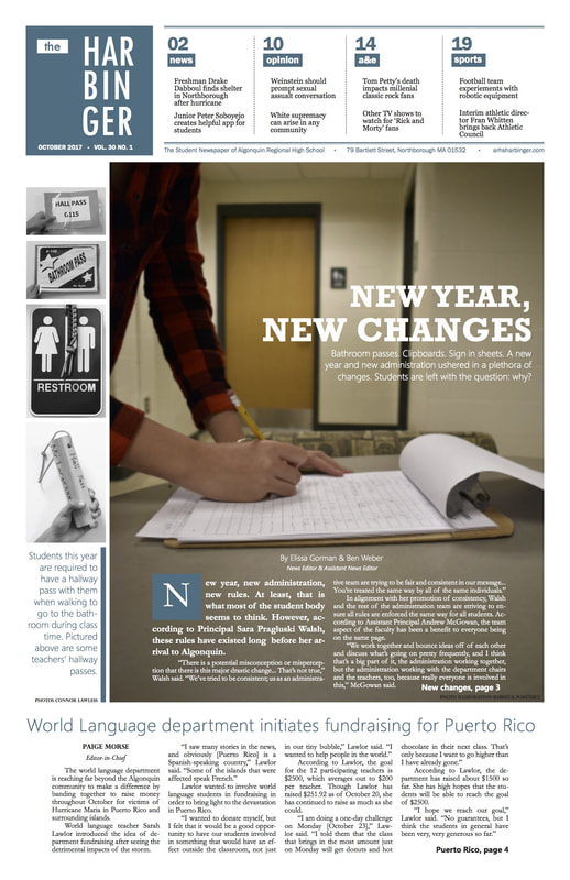
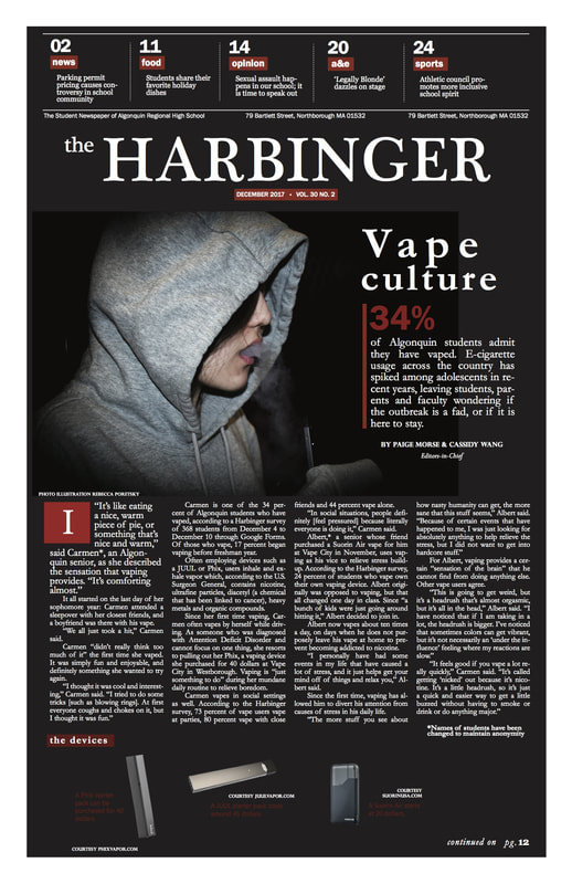
The first design I came up with for the front page is the image on the right (Vol. 30 No. 1). Even though it received great feedback, I personally wasn't satisfied with it. So I created the design on the left (Vol. 30 No. 2).
----------
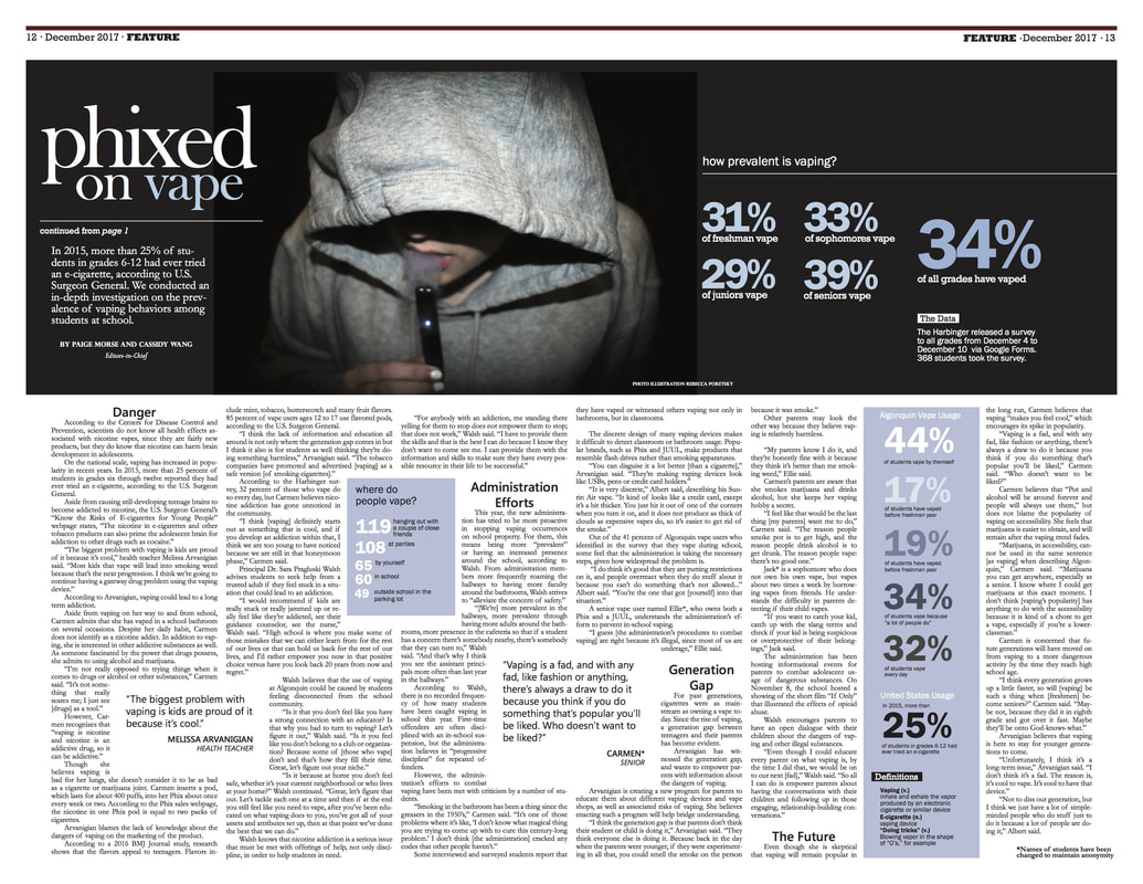
Immersive photography is central to the front page. The photo must be compelling and encompass the central theme of the story. Luckily, we have an incredible photo editor who I work closely with each issue to plan out the creative elements of each issue. For the vaping front page, hard statistics are the distinguishing element of the story since it conveyed the frequency of vaping at our school. So, naturally, I wanted that to capture the reader's interest.
The first design I came up with for the front page is the image on the right (Vol. 30 No. 1). Even though it received great feedback, I personally wasn't satisfied with it. So I created the design on the left (Vol. 30 No. 2).
----------
Immersive photography is central to the front page. The photo must be compelling and encompass the central theme of the story. Luckily, we have an incredible photo editor who I work closely with each issue to plan out the creative elements of each issue. For the vaping front page, hard statistics are the distinguishing element of the story since it conveyed the frequency of vaping at our school. So, naturally, I wanted that to capture the reader's interest.
|
|
Spot Color
One of our goals for this year was to incorporate in-depth pieces into each print issue. Simultaneously, we wanted immersive, seamless design to captivate readers with these stories. Incorporating spot color on select pages can make a big difference for the overall look of the publication; the theme color of each issue creates consistency across our work. To help section editors adjust their layouts to this change, I set the standard for spot color implementation.
One of our goals for this year was to incorporate in-depth pieces into each print issue. Simultaneously, we wanted immersive, seamless design to captivate readers with these stories. Incorporating spot color on select pages can make a big difference for the overall look of the publication; the theme color of each issue creates consistency across our work. To help section editors adjust their layouts to this change, I set the standard for spot color implementation.
|
|
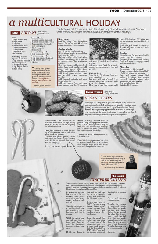
Cultural Holiday Food Spread
Published in Vol. 30 No. 2, December 2017
Across cultures, the holiday season has the same meaning: food, togetherness, warmth and joy. However, each culture celebrates the holidays differently, with different food, traditions and festivities. This holiday spread featured traditional holiday recipes: an Indian dish, vegan Jewish latkes and gingerbread men.
Vape Culture
An impactful article merited an equally impactful layout. In addition to the front page, I designed the double truck feature pages. Our process of gathering survey data was extensive and the results were fascinating so I made that a dominant component of the page, along with an eye-catching photo.
Why We Eat What We Eat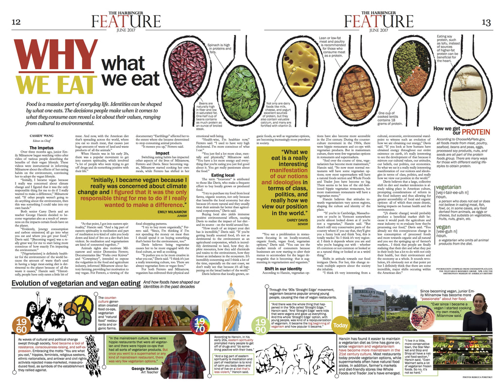
|
This was my first feature, in my first issue as Editor-in-Chief. Vegan foods are known for its vibrancy and vivid colors. Inspired by the vegan bowls and salads I frequently see on Instagram accounts, I wanted to carry the colors over to the page. A frequent question vegans and vegetarians receive is, "how do you get your protein?" The top header graphic is a representation of how people with varying food diets get their protein; it serves as a representation of the diversity of food habits in our community.
-------- When I interviewed an art teacher, a vegetarian for over 40 years, for the article, he described how veganism has changed overtime. From the 1960s to now, plant-based foods have become increasingly mainstream. Back then, veganism and vegetarianism was popular among the counterculture to protest against mainstream culture. I found the shift fascinating, so I incorporated the information into a visual timeline of plant-based diets through the decades. |
